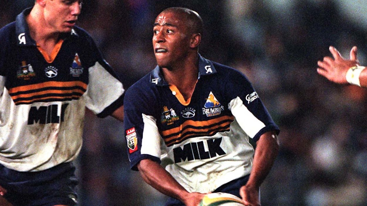
Five retro Super Rugby jerseys that need to be brought back

Super Rugby is now old enough for the retro jersey to be a viable option. Here are five classic designs that deserve a second life.
It’s finally happened – 21 years into Super Rugby, a team is selling a retro jersey.
The Brumbies’ 1996 ‘Classic’ brand jersey is a timeless design, some may even say iconic. They have certainly never managed to top it since, and there have been few better shirt sponsors anywhere in the world than Canberra Milk’s simple, bold ‘MILK.’
[rugbypass-ad-banner id=”1473723684″]
The invisible threshold for things to pass over into ‘retro’ status seems to be about 20 years. Will other sides soon follow the Brumbies’ lead and start reissuing their late-90s jerseys? We can only hope.
Here are five other retro Super Rugby jerseys begging for a revival.
Stormers (1998)
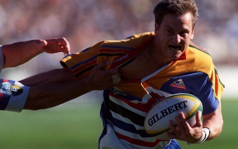
The first Stormers jersey combined the colours of the three unions which made up the franchise – Western Province, South Western Districts and Boland. Some might say it’s a bad idea to put every primary colour on a rugby jersey but not me. Bring it back!
Blues (1997)
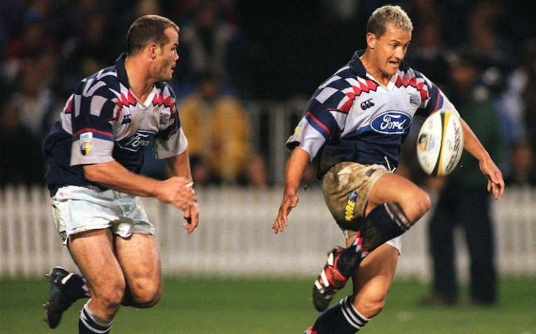
The ‘court jester’ patterning on the shoulders of this jersey certainly suited the Carlos Spencer era of the Blues. It may also hold the key to finally making the team good again. Bring it back! (Also note the subtle argyle flourish on the socks… very nice.)
Sharks (1998)
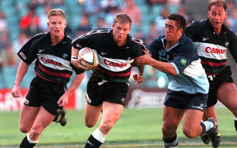
The Reebok era of Sharks jerseys produced some classic designs but none more so than this one. Note the band of Reebok logos across the shoulder and the flawless sponsor integration. Bring it back!
Chiefs (1997)
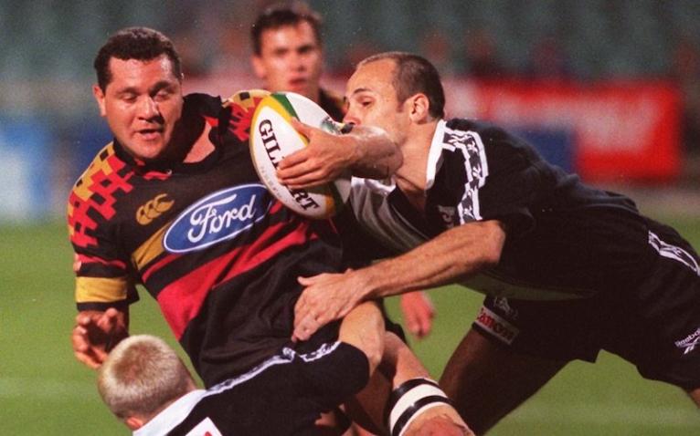
This pixelated shoulder design was incredibly ahead of its time for 1997, considering most of the Waikato wouldn’t have even had dial-up internet yet. It looks to have been the Chiefs’ alternate jersey, only ever worn a handful of times, but who cares. Bring it back!
Bulls (1997)
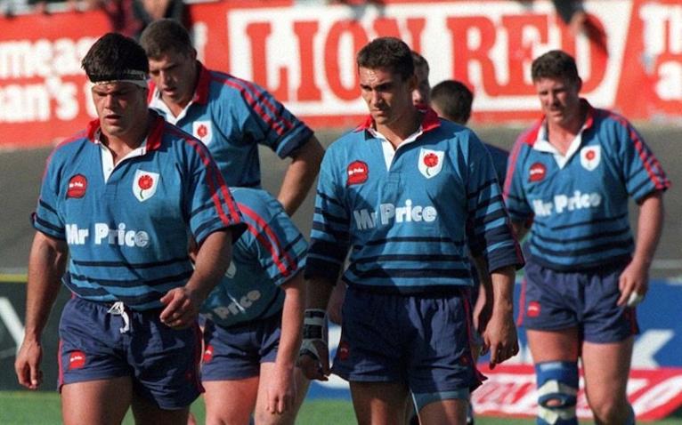
Perhaps the greatest retro jersey Super Rugby will ever know. The Northern Transvaal Blue Bulls 1997 jersey is the complete package. The awesome ‘Mr Price’ cap logo, the simple and elegant Northern Transvaal crest, the two red stripes down the shoulders – they all come together perfectly. Bring it back!


