Stuck for a Super League team to support? Look no further than the logos, ranked from best to worst for your convenience.
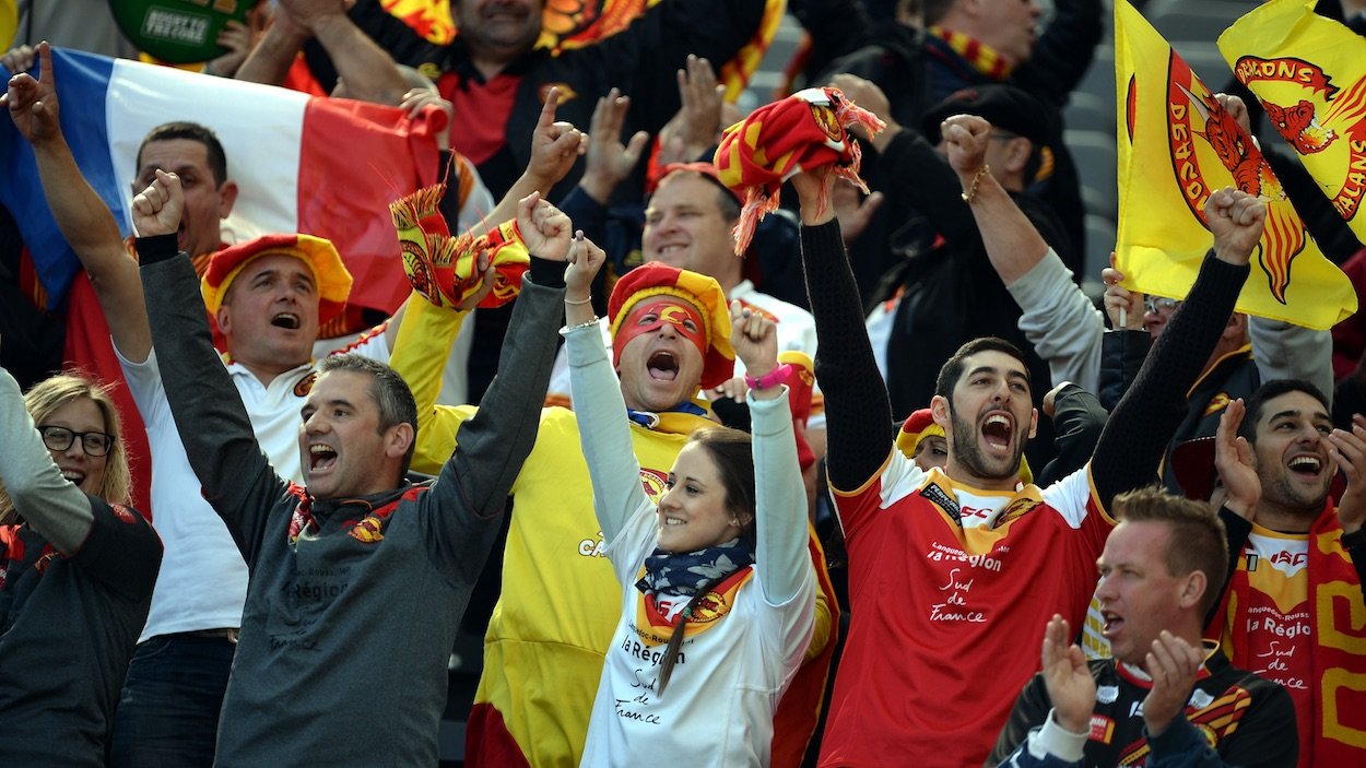
Unless you happen to hail from the north of England or the south of France, choosing a Super League team to support can be a neverending nightmare of bewilderment and regret.
Conventional wisdom would suggest you choose the team with the best or coolest players, but players come and go. A couple of years and you could be stuck supporting the worst team of unlovable idiots rugby league has ever seen. Another train of thought would suggest choosing the team with the most exciting playing style, but just like players, coaches are little more than dust in the wind in the great scheme of things.
The secret to choosing a Super League team is simple, and it’s been hiding in plain sight the whole time. It’s the logo. In a world of constant changes, a logo is one of the few things you can rely on. A logo will last decades, sometimes even centuries.
And the Super League is home to some of the best logos in professional sport. Its foundation in 1996 – replacing the old Rugby Football League Championship – provided England’s ancient rugby league clubs with the perfect opportunity to break the shackles of tradition in favour of a beautiful 1990s design aesthetic.
Here are all 12 Super League team logos, loosely ranked from best to worst based on how they’d look printed on the front of an otherwise plain white t-shirt.
1. Catalans Dragons
The only French side in the competition, the Dragons logo looks like it belongs to a karate club more than a rugby league club – this is surely the highest praise any logo can get.
Choose this club if you like: Martial arts; hard fantasy novels
2. Castleford Tigers
The circular majesty of the Castleford Tigers logo is as close to sports design perfection as any logo in the world. Almost too good as a t-shirt design; could be mistaken for high-end streetwear.
Choose this club if you like: High-end fashion; big cats
3. Wigan Warriors
From a distance Wigan’s logo looks old-fashioned and boring, but closer inspection reveals it to be an intricate and beautiful work of art, depicting a nonchalant King holding a miniature lion.
Choose this club if you like: Magical realism; primary colours
4. Salford Red Devils
Red Devils is one of the best team names in Super League, but having a likeness of Satan himself as their club logo truly takes things to the next level. Very scary and extremely cool.
Choose this club if you like: Satanic worship; occult rituals
5. Leeds Rhinos
The rhinoceros is frequently and unfairly overlooked when it comes to animal-inspired sports team names. Full credit to Leeds for thinking outside the square, and full credit for following through with this sick logo.
Choose this club if you like: Rare animals; 90s slacker aesthetic
6. Widnes Vikings
Remarkably minimalist and subtle for a sports logo, if you wore this on a t-shirt most people would be none the wiser that it had anything to do with rugby league. Hard to say if that’s a good thing or a bad thing.
Choose this club if you like: Minimalism; Norse legends
7. Huddersfield Giants
Where Widnes have gone for subtlety, Huddersfield Giants’ logo screams rugby league. Specifically, it screams “THE BIRTHPLACE OF RUGBY LEAGUE”. A great, ugly logo.
Choose this club if you like: Historical boasts; ironic t-shirts
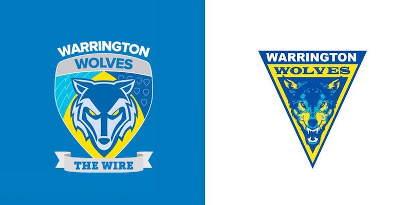
8. Warrington Wolves
Wolves have the newest logo in Super League, unveiled in 2015. It’s good – ‘The Wire’ is a wonderfully oblique nickname – but nowhere near as good as their previous logo, which featured one of sport’s all-time scariest wolves.
Choose this club if you like: Wolf iconography; mysterious slogans
9. Wakefield Wildcats
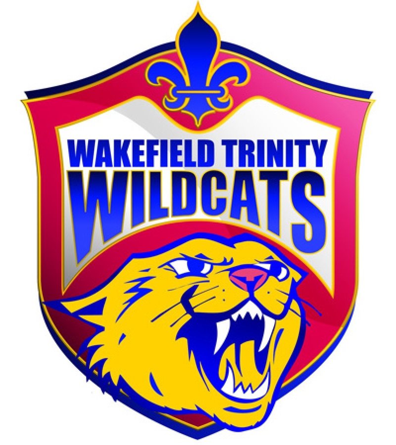
The Wakefield Wildcats cat, captured mid-hiss, is one of the angriest and best sporting cats. The rest of the logo makes it look a bit like a kind of cheap regional lager. Pint of Wildcat please!
Choose this club if you like: Lager; pints thereof
=10. Hull KR / Hull FC
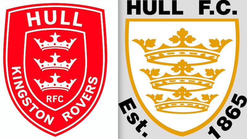
Impossible to separate the two Hull clubs, who confusingly have near-identical logos. Both feature a simple triple-crown motif – take your pick between the gold crowns of FC or the white-on-red of KR.
Choose this club if you like: Simplicity; crowns
12. St Helens Saints
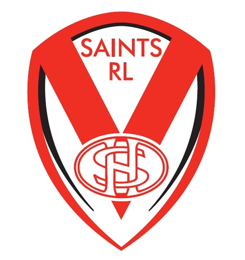
St Helens are one of the most consistently successful clubs in the Super League, but they have easily had the worst logo since they plonked their old interwoven ‘SH’ logo inside a crest designed on MS Paint in 2010.
Choose this club if you like: Winning; not caring about design


